Archer Dynamic Workflow Tracker (DWT)
The Archer Dynamic Workflow Tracker (DWT) Tool & Utility is an Archer custom object designed to provide a graphics rendering of the execution progress of a linear workflow that can be placed anywhere in a content record web form and positioned on the top.
Archer Exchange: With the Archer Exchange, the Archer team has created a broad selection of supplemental, value-added offerings to help you get your unique risk management program on the right path, right from the start. You can leverage the Archer Exchange offerings to expand the use of Archer solutions into new business processes and address specific industry, geographic, regulatory, or technical requirements.
To learn more about this offering see Archer Dynamic Workflow Tracker Tool & Utility on the Archer Exchange.
On this page
Release notes
| Release Date | Version | Notes |
|---|---|---|
|
January 2026 |
2025.12 |
Recertified on Archer Platform Release 2025.12 for Archer On-Premises and Archer Platform Release 2025.10 for Archer SaaS operating in Classic Mode. |
| June 2025 | 2024.11 |
Recertified for Archer Platform Release 2024.11.02 (6.15.0.4.2) for Archer On-Premises and 2025.04 for Archer SaaS in Classic Mode. |
|
January 2024 |
6.14 |
Issues fixes only no new functionality. The fixed issues are the following:
|
|
July 2023 |
6.13 P1 (3.x) |
This version is a complete rewrite of the previous code. The software rewrite was mainly driven by the new look and feel, which is more aligned with the current Archer standards. See the table below for a detailed list of changes and enhancements. |
|
April 2022 |
6.12 P1 (2.x) |
Updates include:
|
|
November 2022 |
6.12 P1(1.x) |
Initial Release |
Overview
Benefits
The Dynamic Workflow Tracker is fully configurable and includes many capabilities described below:
-
Configurable graphics style: the default style is modern and aligns with Archer UI standards. The custom object supports the chevron style for backwards compatibility.
-
Configurable placement: can be stuck on top so that it remains visible when you scroll the content, or it can be placed in any position within the web form, including inside the form tabs (opened or closed).
-
Configurable colors and support for color schemes (some of which are included by default).
-
Chevron style can have a transparent background and a colored border.
-
Configurable size for any element, such as the height, width (can be stretched or not), text, and so forth.
-
Supports different settings for the past (completed), current, and future phases.
-
Supports the concept of sub-phases to keep track of the origin phase when you land into another one.
-
Tracker can be collapsed to save real estate in the web form. The collapse/expand status is configurable and can be disabled.
-
Fully responsive behavior: when the browser window is shrunk below a given resolution, an accordion menu is displayed and can be pushed to display a vertical sequence of phases.
-
Text is dynamically scaled depending on browser width.
-
Configurable tool tips (popovers) with configurable text.
-
Configurable icons (the Google Material Design set is used).
-
Support of Display Layers to allow either a static or dynamic selection of the phases and sub-phases to display at run time. This capability allows it to display at run time different trackers.
-
The values list items that model the phases and sub-phases can be disabled to hide their rendering.
-
Portable across the development, test, and production environments. The custom object uses the alias name to target the Archer fields which usually persist as packages are installed into other environments (as opposed to their FieldIds which may differ in each respective Archer instance and typically requires modifying the custom object code).
-
Multi-instance display: a single custom object allows to display multiple instances of the tracker in different areas of the Archer layout. Each instance is configured independently.
-
Automatic capitalization of phase and sub-phase names.
-
Extremely quick deployment (with default settings). If the status values list uses the default alias name, a simple copy and paste of the source code is all that is needed.
-
Easy configuration. All the configurable parameters are handled as CSS variables stored at the beginning of the custom object code and can be easily changed with any text editor before copying the custom object code.
-
Source code available in two versions: fully commented code (useful for debugging) or minimized (useful for production and half the size of the previous)
-
Enhanced performance and robustness: a new caching mechanism allows to limit the API calls needed to pull the data from Archer.
-
Improved error handling: when a runtime error occurs or a configuration parameter is wrong, the error message provides the proper guideline to fix the issue.
Prerequisites (ODA and system requirements)
| Components | Prerequisites |
|---|---|
|
Archer Solution areas |
Any |
|
Archer use cases |
Any |
|
Archer applications |
Any |
|
Uses custom objects |
Yes Note: The custom object does not have any strict dependency on the platform version and can also be used with previous versions. |
|
Requires On-Demand license |
No |
|
Archer requirements |
|
|
Supported Archer environments |
|
Archer Dynamic Workflow Tracker Tool & Utility components
Key concepts
The Archer Advanced Workflow functionality allows you to add a non-linear multi-step workflow (which is actually a state machine) to any application or questionnaire.
Workflows can be composed of multiple nodes with branches and joins and multiple forward and back transitions.
The execution flow is sequential and the workflow current node corresponds to a specific phase. Archer displays a high-level view of the phase execution progressas follows:
-
Current Phase (one phase in progress)
-
Past Phase (one or more completed phases)
-
Future Phase (one or more future phases to be completed)
It is also possible to transition back and forth between any two phases, not necessarily adjacent: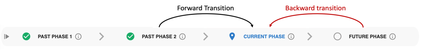
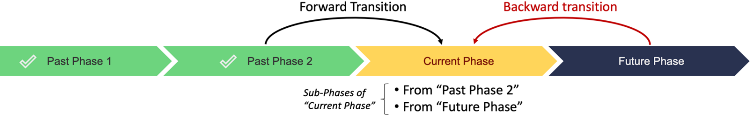
In the GRC space, the typical example is the assessment (any type). The workflow starts, includes some preliminary activities and then the assessment starts, so the first time it is done, it can be defined “In progress”. After its completion, the assessment is sent to the reviewer where the latter could either approve the submission and move it to the next stage or reject the assessment. In the latter case the workflow transitions back to a status where the submitter can amend the assessment.
This pending resubmission status is NOT the same as the first time the assessment was edited (i.e. it was already filled in), so the proper modelling of the workflow should include another status to keep track of the changed conditions.
At a high level, this status is still about the editing of the assessment, so it does make sense to define an Assessment Phase and two Sub-Phases to represent the initial assessment operation and the assessments after a rejection:
Assessment Phase (current phase)
-
In Progress Sub-Phase (initial assessment, landing in the current phase from the “left”, that is from the past)
-
Rejected by Reviewer Sub-Phase (sub-sequent assessments after a rejection from the reviewer, that is landing in the current sub phase from the “right” that is from the future)
This possibility also allows keeping track of the origin of the incoming transition into the Assessment phase:
-
The “In Progress” sub-phase means I am doing the assessment for the first time; the workflow is coming from the left (the beginning of the sequential flow).
-
The “Rejected by Reviewer” sub-phase means I landed again into the Assessment after a rejected review; the workflow is coming from the right.
The image below summarizes and generalizes these concepts:
Custom object
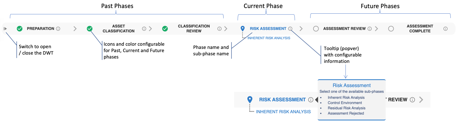
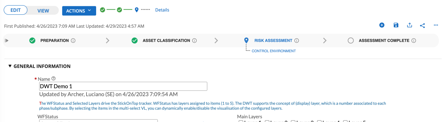
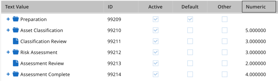
The Dynamic Workflow Tracker (DWT) is an Archer Custom Object that fully supports the concepts described in the previous paragraph. The phases and sub-phases can be defined using a two-level values list, where the first level (parent) models the workflow phases, and the second level (children) models the sub-phases. Values List items can be enabled or disabled, and this status is acknowledged by the custom object, so that phases can be removed from the rendering. Moreover, each values list item has a Description text field which is leveraged by the custom object to configure some elements of the phases such as the icons and the text rendered. This allows for the configuration of some aspects of the custom object without changing the code of the custom object, making it easy to use! The picture below shows a fully rendered custom object (using a generic asset classification and asset risk assessment as an example):
The graphics include various fully configurable elements as summarized by the following picture:
Placement
One of the key capabilities is the placement of the workflow tracker which can be set to be either “stuck on the top” or placed anywhere in the record web form (any section or any tab within a form). In the first case, which is the default option, the workflow tracker is constantly anchored to the top, just below the toolbar; when the record content is scrolled, the workflow tracker is always displayed on the top.
Responsiveness and auto scaling
The DWT exposes a responsive behavior, and this means that the tracker reacts and adapts to the available space. Starting from the standard appearance:
When you reduce the horizontal width of the browser, the tracker turns into an accordion button. When the accordion is clicked, the menu expands, and the phases are displayed aligned as a vertical sequence:
Note: The responsive behavior is fully implemented in JavaScript and does not use the “@media” CSS directive. This is because the latter introduces a noticeable delay when the Chrome browser is used (this is only in the context of the Archer custom object).
Regarding the auto scaling capability, starting from the default visualization:
As the browser windows is shrunk horizontally, the available space for each phase decreases, and the font size of text labels and icons automatically changing to adapt to the available space:
Tracker style
The DWT supports two graphics visualization styles to display the phases.
The default style is called “modern” and it’s aligned with the Archer graphics standards. This is how it looks like:
However, DWT is also backwards compatible with the previous version and supports the style named “chevron” that looks like this:
The SVG graphics technology is used to render the different graphic shapes. This technology provides more flexibility; so that it’s now possible to render the chevrons with a transparent background and a colored border (background and borders can also be displayed together):
Installing the Package
Step 1: Extract the files
Unzip the contents of the installation package into the target folder.
It contains two custom objects: one for development environments (includes commented JavaScript code) and one for production environments (JavaScript and CSS code)
Step 2: Configure the Archer Dynamic Workflow Tracker Tool & Utility
See Configuring the Archer Dynamic Workflow Tracker Tool & Utility for complete information.
Step 3: Test the installation
Test the application according to your company standards and procedures to ensure that the use case works with your existing processes.
Configuring the Archer Dynamic Workflow Tracker Tool & Utility
Deployment
Each Archer field has a name and an alias. When a new field is created, the alias name mirrors the field name (except for spaces and special characters). The only system requirement is that the alias name must be unique within the application, but in general the field name and alias name can be different.
There is only one mandatory requirement to deploy the DWT: a values list field that hosts the phase/subphase (status) information to be graphically rendered.
This field can pre-exist within the application/questionnaire (a use case application with an existing workflow) or it can be built from scratch.
Status Values List built from scratch
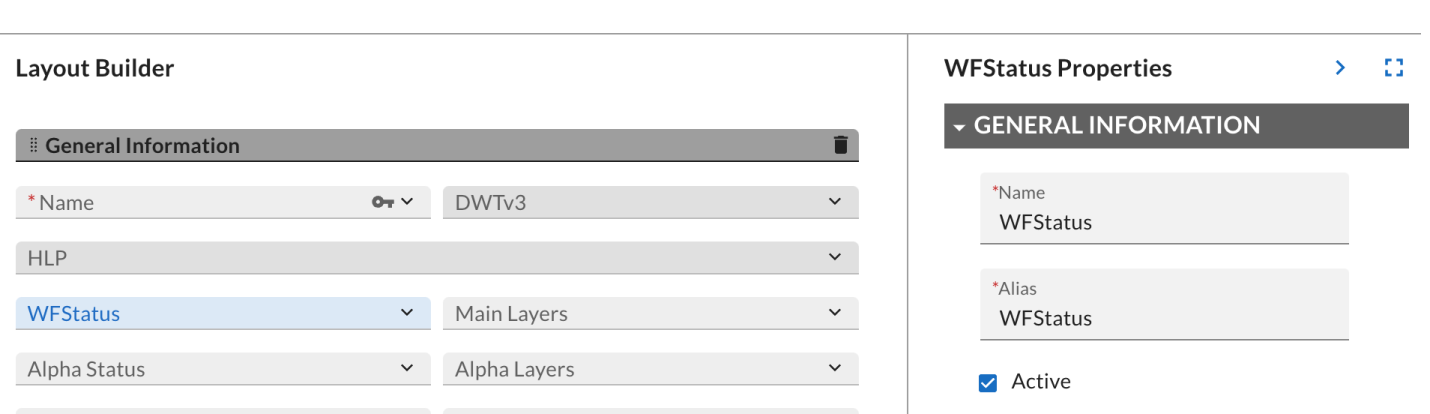
Create a new values list with any name and set the alias to the string WFStatus which is the default used by the custom object, so that you don’t have to change the configuration parameters in the custom object code. (If you do change the alias name you would need to make a small change to the configuration parameters: see Custom Object Configuration.)
Add some values list items, for example:
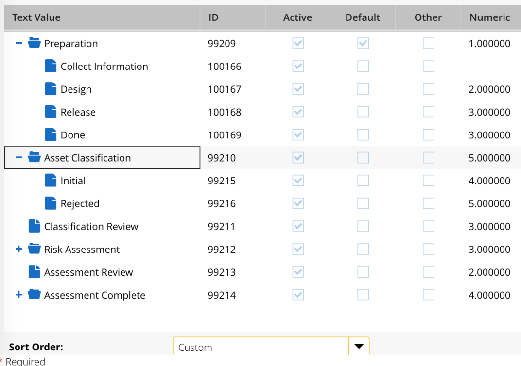
Select the custom sort order to set the proper sequence of statuses and define one of the values list items as the default one.
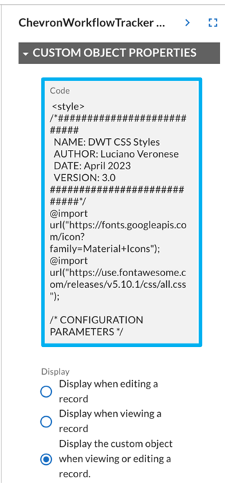
Create a new custom object (Layout Objects in the Designer of the layout that will display the Custom Workflow Tracker) and place it wherever you want in the layout.
Set its name (for examle, DWT), then copy the source code of the custom object file from the distribution, into the code window.
Make sure to set the Display option to “when viewing or editing a record” so that the workflow tracker will always be visible.
Save the application.
Create a new record of the application you just modified. Make sure that one of the values list items of the status values list is selected (but a default should be defined), then save the record.
A spinning wheel is displayed for a couple of second (depending on the network speed), and eventually, the Dynamic Workflow Tracker is displayed.
The picture below shows an example:
If you use the default values list field alias name, the only action required is to create the custom object and copy and paste the provided source code.
The custom object leverages the Archer RESTful APIs to retrieve the values list information. The visualization of the DWT relies on the information about the structure of the values list as well as the currently selected item. However, the latter can be read only when the record is saved at least once. Conversely, the structure of the value list can be read regardless the status of the content record, but the API calls are different for the new records and the committed records.
To read the structure of the values list for new records (not yet saved), the APIs require the value of the Application Alias, and this value must be configured in the custom object configuration parameters.
Since this value cannot be provided by default (it’s the alias of the hosting application), this means that for new records, the DWT cannot be displayed, unless the configuration parameters are properly updated.
The deployment of a custom object is always layout specific. To display or execute the custom object regardless the user action node you are in, replicate the deployment of the custom object in all the layouts defined.
Existing Status Values List
If you want to deploy the DWT for an existing status values list field, the values list field and its attributes such as field name and alias are already defined. To deploy the custom object, you still have two options:
-
If you can change the alias name of the existing values list, change it to the default value of “WFStatus” so that you don’t have to change the configuration parameter in the custom object.
-
If you cannot change the alias name (the alias is being referenced in mail merge templates or other custom objects), then you need to change the value of the CSS variable in the custom object that identifies the status VL alias. You can change this value either after you copied the source code into the custom object or before pasting it into the custom object’s Code field using any text editor.
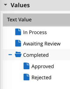
Sub-phases and its advantages
Most of the workflows in the out-of-the-box configurations of the Archer use cases adopt a simple “review and approve” style of workflow, but in addition to the Approved status, the workflow also includes the Rejected status.
Adding the DWT to the applications that adopt this workflow leads to a visualization as shown here.
In the example above, the operating test is approved, but there is also the Rejected status which is placed after the Approved status in the linear flow of execution.
To improve the visual representation of the workflow, it is possible to leverage on the sub-phase capability of the DWT.
This requires a small tweak to the structure of the value list items, by adding a new status we can name “Completed” (or anything else) and move the existing Approved and Rejected status below it, as shown in the picture.
In this way we have one “macro phase” named “Completed” and two sub-phases named “Completed->Approved” and “Completed->Rejected”. Basically, this is one macro phase and sub-phases provide more details about the why the workflow landed into the Complete status. This is just one of the many possibilities when leveraging phases and sub-phases.
When you apply these changes, the outcome is something like this:
Changing the structure of the values list items for an existing workflow is not disruptive at all, because the workflow will use the “hierarchical version” of the previous items that is “Completed -> Approved ”instead of“ Approved and “Completed -> Rejected ”instead of“ Rejected. The DWT will use the parent phase as the main phase to display, as shown in the previous picture.
Custom Object configuration
The DWT custom object has been designed with the primary objectives of ease of use and comprehensive configurability.
Configurability consists in providing as many configurable capabilities as possible, in order to adapt the overall functionality to the specific context and use. For example, it is possible to configure the size of the elements, the labels, colors and the presence of elements like icons, etc.
The ease of use if about minimizing the configuration and deployment effort, so that adding the tracker to a new or existing application only takes a few minutes, if not seconds. This is achieved by providing a default configuration for any aspect of the custom object. As previously described, the workflow tracker leverages a values list field to get the status information to display and by default the custom object reads from a values list field with a specific alias (“WFStatus”). This means that if the values list field alias that is used is assigned this name, the deployment of the custom object simply requires a copy-paste of the source code.
This ease of use also extends to the configuration process itself to greatly reduce the need to change the actual code of the custom object. With this goal in mind, the configuration of options has been split into two levels:
-
Basic configuration aimed to configure the per-phase information that is most likely to be changed. This information is stored within the Description property of each values list item and can be edited using the Archer Values List Configuration UI.
-
Full configuration aimed to configure all the other elements that apply to the whole custom object. In this case the configuration parameters must be stored and edited in the custom object code itself.
A custom object is actually a piece of HTML code and as such it requires a specific format as shown here.
<style>
CSS code
</style>
HTML code
<script>
JavaScript code
</script>
The sections for CSS, HTML and JavaScript code must generally be placed in that order, i.e. CSS is declared before the HTML code.
CSS defines the visual appearance of the HTML elements, but it allows the definition of variables using “key-value” pairs.
The DWT custom object takes advantage of this concept by exposing its configurable elements using an easily accessible CSS variable that is stored at the beginning of the custom object code.
Basic configuration
The elements that are more likely to change are the icons, the title prefix and the sub-title in the tooltip and the option to hide or show the name of the phase status to display a phase with the icon only.
Since all these attributes must be configurable independently for each phase (i.e. for each values list item), their configuration is handled through a simple JSON object text that is stored in the Description area of each values list item. The big benefit of this approach is that it is possible to configure some phase-specific attributes without changing the custom object code. The general format of the JSON object is this(note that in version 3, the JSON property “spoverride” has been removed):
{ "mdicon": "<name of icon>", "titleprefix": "<text for the prefix of the tooltip title>", "subtitle": "<text of the tooltip sub-title>", "displaytitle": "<yes | no>", “layer”: “<number>” }
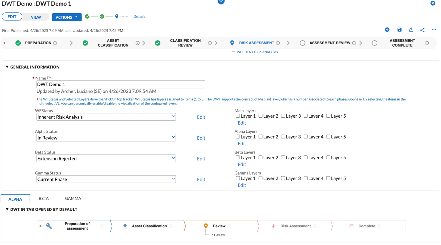
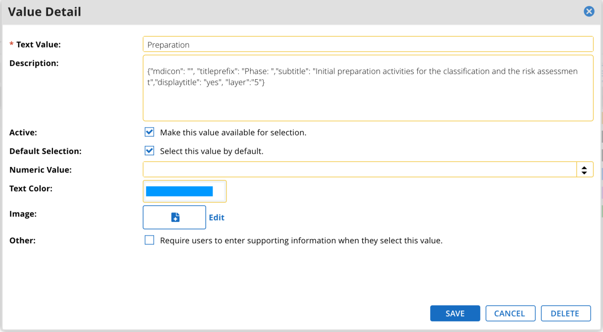
The VL item description text can be modified by Archer Admins from either the frontend or the backend. The easiest approach is to leverage the frontend and click on the Edit link adjacent to the values list field within a content record. When you click on any item, regardless the level, a form like this is displayed. (This example shows a parent item, that is a level 1 item):
This is an example of JSON object that allows to configure the icon, add a prefix to the title and display a subtitle in the tooltip:
{
"mdicon": "grading",
"titleprefix": "Step:",
"subtitle": "The reviewer is checking the outcome of the risk assessment"
}
Any JSON property (a property is a name/value pair) is optional as well as the whole JSON object. This implies that the Description of a values list item can be empty (of course this is true for any new or existing values list) so that the DWT will display only the name of phase and the tooltip will include just the title. In general, you can add or remove any of the supported properties, but it’s paramount to not break the JSON format in the process. Specifically, make sure quotes surround the property names and values, a colon separates the property name from its value, and that properties are separated with a comma. If you want to add any of the parameters of the basic configuration, you may start with the empty template of the JSON object reported below:
To edit JSON content, use a text editor like Notepad or Notepad++ (not Word as it adds hidden metadata). Add the text within the quotes, or remove the properties you don’t want to use, copy the modified text and paste it into the Description information of the values list item you want to change, and finally save the field.
The configuration is immediately effective.
You can add a JSON object to the Description field of any VL item, but the custom object will use only the properties that are applicable to the item level. Specifically, the properties “mdicon”, “titleprefix”, “subtitle”, “layer” and “displaytitle” are considered when the JSON is applied to the level 1 (the parent) while the “layer” is the only valid property for the JSON object of the VL item level 2 (the sub-phases).
The value text of the “titleprefix” and “subtitle”properties can also include HTML tags.
Basic configuration examples
When the VL item description is empty (i.e. no JSON object or empty object -- which is the initial condition), both the chevron phase and the tooltip includes just the name of the phase, i.e. the name of the VL item. The JSON properties allow you to change the default behavior by adding an icon to the phase or some text to the tooltip. Below you can find some configuration examples for the most typical cases:
|
Display a phase with the title and icon |
|
{ |
|
Display a phase with the icon only |
|
{ "displaytitle": no |
|
Set the layer to 2 for the specific phase or sub-phase |
|
{ |
|
Display a phase with the title only. The tooltip includes a prefix and a subtitle |
|
{ "titleprefix": "Phase: ", "subtitle": "This is the subtitle of the phase" |
In case of errors in the JSON object format, no error message will be displayed at the web form level, but the custom object issues messages in the web browser console. In the case of unexpected outcomes, click F12 while in Chrome to access its Developer Tools to investigate.
Tool-tips
The DWT custom object also supports tooltips (they are actually popovers as they require a specific click on the phase to be displayed). By default, a tooltip content includes the name of the phase along with the sub-phases, if defined for that phase.
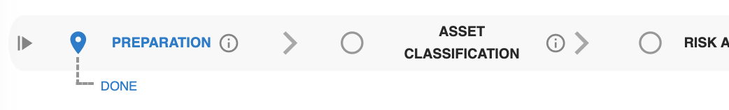
Consider the following example:
The currently selected VL item is the parent item named “PREPARATION”. When the sub-phase named “Done” is selected, the graphics rendering is like this:
If you click on the  icon of the “PREPARATION” phase, the following tooltip is displayed:
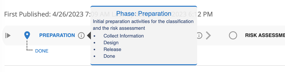
By default, that is when the Description is empty, the tooltip displays just the name of the phase title and the available sub-phases. If you add an icon, a subtitle, and override the layer, the JSON content looks like this: this is what you get:
{ "mdicon": "home", "titleprefix": "Phase: ", "subtitle": "Initial preparation activities for the classification and the risk assessment", "displaytitle": "yes", "layer": "5" }
Configuring the icons
The most likely parameter you might want to change is the icon associated to a given phase; to do this, you need to assign a name to the “mdicon” property of the JSON file.
There are many libraries of icons available on the internet. One of the most popular is the “Material Icons” by Google. Please note the “Material Icons” is the term used by Google to refer to the icon library aligned with the Material Design guidelines. Very often, the term “Material Design Icons” is also used, but this refers to a different icon library aimed to cover the gaps Google left with their set and allow a lot more community integration. The DWT custom object uses the “Material Icons” and not the “Material Design Icon” set. The latter is more extended, so if you pick an icon name from this set, the icon will be displayed only if it’s also included in the Google icon set.
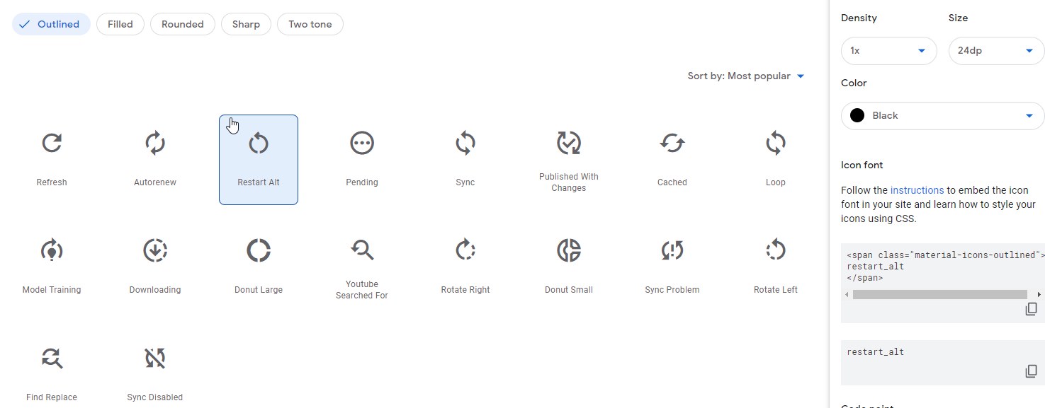
You can browse the available icons in Google Material Icon Set by visiting the following URL: https://fonts.google.com/icons?selected=Material+Icons
For example, an icon search against the keyword “progress” yields the following results:
Clicking on the “Restart Alt” icon would display the following screen:
The text you have to use for the mdicon property is the one on the right, i.e. “restart_alt”.
Basically, the icon names are all lowercase, with spaces replaced by underscore characters (_).
Display Layers
Concepts
The concept of “Display Layer” is inspired by the concept of “photo layer” available in many photo-editing tools. A DWT phase is (statically) associated with a number greater than 0. This number identifies a “virtual layer” which the phase or sub-phase belongs to. The custom object allows you to select the layers that will be displayed at any given time, and this selection can be either static or dynamic.
Static configuration
The layers to display are defined through a configuration parameter in the custom object code and represented by a CSS variable. As such, the set of selected layers does not change during the execution of the custom object. However, is an Archer object (application/questionnaire) is workflow-enabled, multiple layouts can be defined and considering that custom-object are layout-specific, this implies that DWT custom objects with different configurations can be defined.
Dynamic configuration
The selection of layers can be established through a multi-select values list whose alias is defined in the Archer object configuration. This implies that the set of displayed phases and sub-phases can dynamically change at run-time, for example it can be updated through the “update node” in an Advanced Workflow.
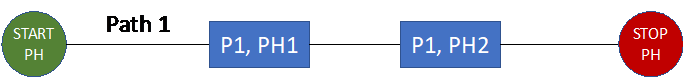
To better describe the concept, let’s assume we have an advanced workflow with two parallels paths that share the start and end nodes. In the picture, the boxes represent the possible phases, not necessarily the user action nodes:
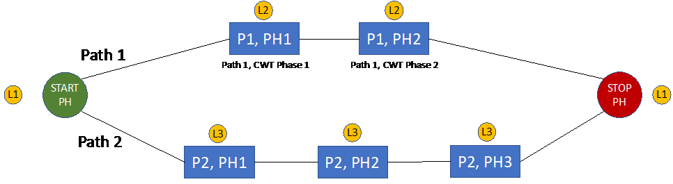
Layers (the circled number) are assigned to the phases, and optionally to sub-phases. In the example above, the start and end nodes are assigned to Layer 1, so when the Layer 1 is selected, both phases will be displayed.
If the custom object is configured to display layers L1 and L2, the displayed phases will be the ones associated with path 1:
If the custom object is configured to display layers L1 and L3, the displayed phases will be the ones associated with path 2:
Below you can see other examples which are screenshots of the real implementation.
These are all the phases of the DWT with the associated layer:
If a layer is not assigned to a phase/sub-phase (empty circle), that layer is always displayed.
If the selected layers are 2,4,5 the displayed phases will be:
Please consider that:
-
Display Layers are only about the visualization, that is they are filters applied during the rendering of the phases and sub-phases. As you can see from the examples above, the visualization of the phases is not influenced by the Past/Current/Future status. This means the currently selected phase might not be displayed in at a given time (this may happen especially for the dynamic configuration)
-
There are no constrains in the definition of Display Layers, so the only check is about the matching. This means that you can label a phase/sub-phase with Layer 1,2,3 and configure the custom object to display the layer 7. In this case, since there is no match, an error will be displayed. If no dynamic layers are selected, the static configuration will be used, and if the latter is not defined, all the phases/sub-phases will be displayed by default.
The management of Display Layers is broken down into two steps:
-
A Layer is assigned to phases and sub-phases you want to filter
-
Layers to display are selected either statically or dynamically
Display layer assignment
This step is about assigning a layer (a number) to a phase or sub-phase. Any number greater than 0 can be used. Assigning a layer to a phase/sub-phase is only required if you plan to use the filtering of phases/sub-phases. If a phase/sub-phase has no layer assigned, it is displayed by default. If you assign to a phase/sub-phase a layer that will never be selected, that phase will never be displayed due to a lack of matching.
Since the DWT phases and sub-phases correspond to the Values List Items of a (2-level hierarchical) Values List (the one used to model the workflow status), assigning a layer can be done in two ways:
-
By using the numeric value that can be associated with each VL item. This is the quickest option. If you don’t assign a number to an item, the phase/sub-phase that correspond to that item will always be displayed. If layers are assigned, the phase/sub-phase is displayed only when the assigned layer matches one of the selected layers, either statically or dynamically. This is an example of configuration of layers using this approach:
-
By using a specific property in the JSON content that can be included in the description. The property is named “layer” and the value is the layer number. This option is available for both phases and sub-phases. This is how it looks like:
{
"titleprefix": "Step: ", "mdicon": "grading", "layer": 3 }
The “property-based approach” can be used if, for some reason, the numeric value associated with the VL item cannot be used to represent the display layer, simply because it’s used for something else (e.g. to calculate risk scores).
This implies that the property value is checked after the numeric value, so that the property value can override the numeric value.
Display layer selection
The set of levels to be displayed can be determined using two approaches: static (static layers) and dynamic (dynamic layers). These two approaches can be individually enabled. When both are enabled, the dynamic layer overrides the static configuration. However, if the dynamic layers are used and no layers are selected (no VL items are set), the configuration reverts back to the static configuration and if the latter is not enabled, then all the layers (all the phases/sub-phases) are displayed by default.
So, by default, when neither the static or dynamic layers are configured, all the layers are displayed regardless the assigned level.
Note: In version 2 of the DWT the static and dynamic selection approaches were not equivalent performance wise. In DWT version 3, a new caching mechanism is implemented to cache the values of some API calls, so that now the overall visualization performance does not depend on the layer selection.
Static selection
The static selection allows to define a list of layers as a configuration parameter in the custom object code through the following configuration parameter (this name is different from v2):
--dwt-layers-list: ;
By default, the value is empty, which means the static configuration of the display layers is DISABLED.
You can enable the static selection, by adding a comma separated list of numbers that correspond to the layers to display, for example:
--dwt-layers-list: 1,3,4;
This statement means that the phases or sub-phases assigned to layers 1,3,4 will be displayed, while the phases/sub-phases with a different layer number will not be displayed.
When is this approach useful?
Custom objects are specific to the Archer layout that hosts the custom object. So, when a workflow uses multiple layouts, an instance of the DWT custom object must be dropped into every layout. However, each instance can be individually configured, so that the displayed phases can be layout-specific.
This is very useful to address the visualization issues related with multi-path workflows that leverage the very same status values list, and the typical example is the Exception Request application in the Issues Management use case. By using a different static selection, it is possible to display just the phases and sub-phases specific to a given path, hence improving the overall visualization.
The static selection also works for new records since it’s pulled from the configuration parameters. In this case, the current phase is set by using the default flag that can be associated to a values list item.
Dynamic selection
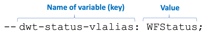
In the dynamic selection approach, the list of display layers to use in the filtering process, is pulled from a multi-select values list, and as such it can change over time, dynamically, for example in the context of the execution of the workflow. The following configuration parameter is available to enable the dynamic selection:
--dwt-layers-vlalias: ;
The default value is empty, which means the dynamic configuration is disabled.
To enable the dynamic configuration, the values list that hosts the layers to select, must be defined first and its alias name should be used as the value of the configuration parameters. So, if the values list alias is named “Selected_Layers”, the configuration parameter looks like this:
--dwt-layers-vlalias: Selected_Layers;
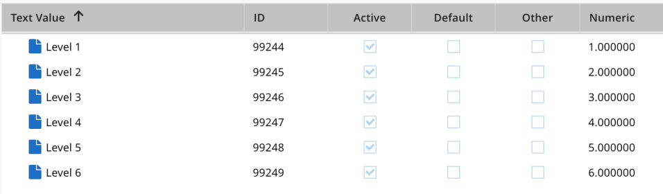
The values list should be configured as follows:
-
Type: multi-select like pop-up or checkmarks
-
Text value: any text string to describe the layer
-
Numeric: the number that represents the display layer
This is an example of values list configured (the item names are not relevant and can be any string):
The values list items can be set manually or, more frequently, in the context of an advanced workflow along with an Update Content node. In this way, depending on the specific workflow path, the phases/sub-phases can be dynamically selected.
It’s important to highlight that the dynamic configuration does not work for new records, since the values list that selects the display layers cannot be read (the record is not yet committed in memory).
There is an interesting side effect of the dynamic configuration.
If the parameter “--dwt-layers-vlalias:” is assigned the very same value of the parameter that hosts the status values list “--dwt-status-vlalias:”, the DWT will display only one chevron and specifically the chevron that is currently selected.
Visualization policies for phases and sub-phases
The Display Layer functionality supports a static/dynamic visualization of phases and sub-bases. In general, phases and sub-phases be optionally labelled with a layer (number) and a sub-phase can be displayed only when its parent phase is displayed (this is the definition of phase and sub-phase).The set of selected layers can be empty (the selection is disabled), it can include some layers that match the assigned layers, and it can also include numbers that are not assigned to any phase/sub-phase.
For these reasons, specific visualization policies are defined:
-
The static selection is enabled when the configuration parameter “--dwt-layers-list” is not empty and is assigned to a comma separated list of numbers (the layers).
-
The dynamic selection is enabled by assigning the configuration parameter
“--dwt-layers-vlalias” the alias of the multi-select values list aimed to host the layers to enable for visualization. -
If a phase does not have a layer assigned and the static/dynamic selection is enabled, that phase is always displayed.
-
If none of the selected layers matches any of the phase/sub-phase layers, an error is displayed.
-
If the set of dynamically selected layers (using the VL) is empty, the list of selected layers is pulled from the static configuration. If the latter is disabled, all the phases are displayed by default.
-
If the status values list is set to target a sub-phase with layer L1, the sub-phase will be displayed if its layer and the parent-phase layer are selected for visualization. In other words, sub-phases are displayed only if the sub-phase and its parent phase are enabled for visualization.
-
If a sub-phase with layer L1 is set from the status variable, but the level L1 is not included in the selected layers to display, the sub-phase will not be displayed.
How to show the assigned layers
The DWT allows you to dynamically display the layer numbers associated to the phases and sub-phases, including the possible overrides.
Please refer to Appendix C: Special commands for more information
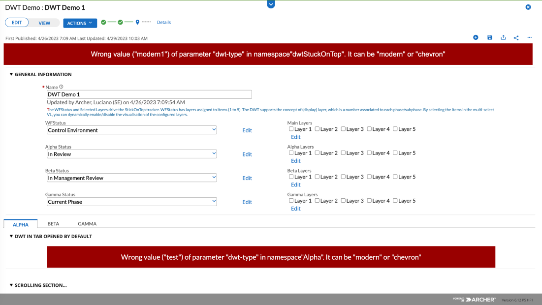
Multiple DWT instances
The DWT custom objected allows to display multiple instances of the tracker inside the same Archer layout. This is an example of how it looks like:
Trackers can be displayed in different positions within the Archer layout:
-
“stuck on top”: if the page is scrolled, the tracker is simply stuck on the upper part of the record page)
-
floating: that is the tracker is stuck to a position within a Section or within a Tab (default or non-default).
The “multi-instance” capability allows to display multiple instances of the DWT in different locations inside an Archer layout. Clearly, only one instance can be “stuck on the top” while multiple instances can be attached to Sections in the main page or within Tabs. Each DWT instance can be individually configured, that is each instance references a specific status values list and has its own graphics appearance.
From a technical perspective, this capability does not require to create multiple instances of the DWT custom object. The instances as configured by adding additional sets of instance-specific CSS variablesand updating the list of namespaces to start.Each set of variables is grouped through CSS id selectors (CSS namespace) that must correspond to the name of the div tag that must be placed into the desired location in the form to enable the visualization of the DWT.
Default configuration (single instance)
The best approach to update the configuration, is to copy the custom object source code into a text editor, to simplify the editing of the file.
At the top of the custom object source code, you can observe the default set of CSS variables, that are collected into a CSS id selector name labelled “#dwtStuckOnTop”. This is the default set of CSS variable that defines the default configuration of the DWTthat will render “stuck on top” (the default case):
:root {--dwt-namespaces: dwtStuckOnTop}
/* MAIN CONFIGURATION PARAMETERS */
#dwtStuckOnTop {
--dwt-type: modern;
--dwt-status-vlalias: WFStatus;
--dwt-current-color-scheme: cs-default;
--dwt-app-alias: ;
--dwt-elasticity: stretched;
--dwt-layers-vlalias: ;
--dwt-layers-list: ;
--dwt-switch: on;
--phase-height: 2.5rem;
--phase-minwidth: 11rem;
--phase-name-fontsize: calc(0.4rem + 0.4vw);
--phase-name-align: center;
--phase-capitalize: yes;
--subphase-height: 1.8rem;
--subphase-fontsize: calc(0.4rem + 0.3vw);
…
The name “dwtStuckOnTop” is reserved, which means that when it is used, the DWT will be displayed “stuck at the top”.
You may want to change this name to display a single instance of DWT in a different location other than the “stuck on top”. In this case, the location would be any section in the Archer content page, including sections on tabs (default or hidden).
To do this, you need first to set a name, for example “dwtFloating”, and replace the string “dwtStuckOnTop” with “dwtFloating”:
:root {--dwt-namespaces: dwtFloating }
/* MAIN CONFIGURATION PARAMETERS */
#dwtFloating {
--dwt-type: modern;
--dwt-status-vlalias: WFStatus;
The above statements instruct the custom object to start a DWT instance attaching it to a div container named “dwtFloating”. Since this does not exist yet, you need to create is by building a very simple custom object (you can use any name) with this content:
<div id="dwtFloating"></div>
and place this custom object into the desired location.
If the DWT does not show up, you can take a look at the browser console to read possible errors.
Adding more DWT instances
Starting from the default configuration that includes the namespace dwtStuckOnTop, let’s assume you want to add two more instances whose namespaces are called Alpha and Beta.
To do this, you need to clone and update the configuration parameters of the dwtStuckOnTop configuration assigning the Alpha and Beta names to the new configurations:
:root {--dwt-namespaces: dwtStuckOnTop, Alpha, Beta}
/* MAIN CONFIGURATION PARAMETERS */
#dwtStuckOnTop {
--dwt-type: modern;
--dwt-status-vlalias: WFStatus;
--dwt-current-color-scheme: cs-default;
--dwt-app-alias: DWT_Demo;
--dwt-elasticity: stretched;
--dwt-layers-vlalias: Main_Layers;
...
}
#Alpha {
--dwt-type: chevron;
--dwt-status-vlalias: Alpha_Status;
--dwt-current-color-scheme: cs-pastel;
--dwt-app-alias: DWT_Demo;
--dwt-elasticity: stretched;
--dwt-layers-vlalias: Alpha_Layers;
--dwt-layers-list: ;
--dwt-switch: on;
...
}
#Beta {
--dwt-type: chevron;
--dwt-status-vlalias: Beta_Status;
--dwt-current-color-scheme: cs-standard;
--dwt-app-alias: DWT_Demo;
--dwt-elasticity: stretched;
--dwt-layers-vlalias: Beta_Layers;
--dwt-layers-list: ;
--dwt-switch: on;
...
}
Each configuration parameter in each ID selector (the namespace) can be individually changed, that is the configurations of the instances are completely independent.
Finally, you must define where the new DWT instances will be displayed. To do this, it is necessary to add a div container somewhere in the web form (section or tab). This can be easily achieved by creating another custom object with just the HTML code to define the div container. The source code is like this:
<div id="Alpha"></div>
and similarly for the Beta namespace.
To make the configuration changes effective, the best practice is to completely clear the web browser cache (in Chrome press F12 to enter the dev console, then right click on the reload button and selected “Empty cache and hard reload”).
Full configuration
All the configurable options that are not phase-specific are part of the “full configuration”.
Since these options apply to the entire custom object, they are stored in the custom object itself and are defined via "key-value" pairs.To simplify the configuration process, the key-value pairs are defined via CSS variables that are positioned at the beginning of the custom object code, not within the JavaScript portion of the custom object’s code.
CSS variables use this specific syntax:--<variable name>: <value>;
For example, this statement allows to define the alias of the values list to read:
The only element you can configure is the value of the related variable.
CAVEAT
In general, after you change the custom object CSS variables, as soon as you save the application and refresh the content record, the effect of the changes should be immediately available. If you don’t get the expected outcome, you may need to hard refresh the web browser cache (a simple cache clean is not enough). This process depends on the web browser. Search the keywords “How to clear your browser cache and perform a hard refresh” to find the proper process for your browser.
During the initialization stage, the custom object includes multiple validation checks against the configured values, so that the workflow tracker is displayed only when these parameters are correct. The custom object allows to display most of the errors directly on the web browser, in the context of the tracker position. However, some errors may trigger before the “error view” is enabled and in these cases the error messages are displayed in the web browser console (accessible by clicking F12 in Chrome).
Within the custom object source code, all the configuration parameters, that is the CSS variable, have been positioned at the top of the code, so that they can be easily accessed and updated.
To further simplify the configuration, the parameters have been split into two sections:
-
The first section on the top includes the parameters that are most commonly updated.
-
The second section includes the configuration parameters that are rarely updated.
The picture below shows the default set of configuration parameters for the default container / namespace which is “dwtStuckOnTop”:
/* MAIN CONFIGURATION PARAMETERS */
#dwtStuckOnTop {
--dwt-type: modern;
--dwt-status-vlalias: WFStatus;
--dwt-current-color-scheme: cs-default;
--dwt-app-alias: DWT_Demo;
--dwt-elasticity: stretched;
--dwt-layers-vlalias: Main_Layers;
--dwt-layers-list: ;
--dwt-switch: on;
--phase-height: 2.5rem;
--phase-minwidth: 11rem;
--phase-name-fontsize: calc(0.4rem + 0.4vw);
--phase-name-align: center;
--phase-capitalize: yes;
--subphase-height: 1.8rem;
--subphase-fontsize: calc(0.4rem + 0.3vw);
/* LOW LEVEL PARAMETERS (RARELY UPDATED) */
--dwt-margin-top: 0.5rem;
--dwt-margin-bottom: 0.3rem;
--dwt-archer-default-color: #176dc2;
--dwt-overall-opacity: 0.9;
--dwt-responsive-size: 600;
--phase-icon-size: calc(1rem + 0.4vw);
--phase-icon-container-minwidth: 2rem;
--layer-height: 1.4rem;
--switch-icon: eject;
--switch-leftmargin: 4px;
--phase-info-icon: info_outline;
--phase-info-size: 1rem;
--switch-size: 18px;
--switch-color: #777;
--separator-icon: arrow_forward_ios;
--separator-fontsize: 1.2rem;
--separator-color: #9E9E9E;
--accordion-icon: account_tree;
--accordion-icon-size: 1.5rem;
--popover-background-color: #f2f2f2;
--popover-title-color: #176dc2;
--popover-title-size: 0.8rem;
--popover-subtitle-color: #1c3363;
--popover-subtitle-size: 0.6rem;
--popover-subphase-color: #1c3363;
--popover-subphase-size: 0.6rem;
--chevron-gap: -0.4vw;
--chevron-strokewidth: 1px;
--chevron-tail-coloring: inherited;
}
Refer to Appendix A for the detailed explanation of each configuration parameter.
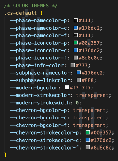
Color schemes
The DWT supports color schemes. Each scheme is a collection of colors for specific elements of the DWT, namely the phase color, title and icon color for the Past, Current and Future phase types. The goal of the color scheme is to quickly switch from one visual representation (related to colors) to another.
Each scheme is identified through a name which can be used in the configuration options to select the currently active scheme.
By default, three color schemes are provided: “cs-default” that matches the Archer color scheme, and “cs-pastel” and “cs-standard” with different colors.
Color schemes are defined as CSS classes (see below). You can either change the colors of any of the existing schemes or create a new scheme from scratch.
To create a new scheme:
-
Copy and paste an existing scheme.
-
Change the name of the scheme (the CSS class. Including the initial dot).
-
Change the colors of the CSS variables.
Note: Instead of editing the CSS code directly in the custom object box, a better approach is to copy the code into a text editor like Notepad, Notepad++or Visual Code, make the changes, and then copy the modified code back into the custom object box.
Configuration Variables
The table below reports all the configurable parameters supported by the DWT version 3.x.
The parameters there were available in version 2.x and that are not included in this table, are summarized in the next paragraph.
| Parameter | Description | Possible values | Default value |
|---|---|---|---|
|
accordion-icon |
Material design icon displayed in the accordion menu that shows up when the responsive mode is enabled. |
Any valid material design icon |
account_tree |
|
accordion-icon-size |
Size of the icon displayed in the accordion menu |
Any valid CSS unit of measure for size. |
1.5rem |
|
chevron-gap |
Gap between two phases when the configured style is “chevron” |
Any valid CSS unit of measure for sizes. The best option is to use the vw unit of measure to scale the gap with the browser window size. |
-0.4vw |
|
chevron-strokewidth |
Width of the border drawn around the chevrons. It can be set to transparent to prevent drawing the border. |
“transparent” or a valid CSS unit of measure for size. |
1px |
|
chevron-tail-coloring |
Defines how the color of the last phase (chevron style only) when when it is in the Current status (the workflow is complete). When the option is set to “inherited”, the color is inherited from the color of the Past status, otherwise the status is the one corresponding to the Current status. |
standard | inherited |
inherited |
|
dwt-app-alias |
Application alias of the Archer level (if a levelled application is used) that hosts the custom object. This parameter acts like a switch. If it’s empty, when a new record is displayed, the DWT does not show up. If this parameter is set to the app alias, then when a new record is created, the DWT is displayed with the default item set as current. |
Any name compatible with the application alias name. An Archer application level must be defined with this alias, otherwise an error is displayed for new records. |
“” (empty) |
|
dwt-archer-default-color |
Color used by the accordion menu, the spinner and the switch. |
Anu HTML color |
#176dc2 |
|
dwt-current-color-scheme |
Select the name of one of the default color schemes or build a new one. |
A string that identifies a configured color scheme. If the color scheme is not found, the default color is silently used for all the phases. |
cs-default |
|
dwt-elasticity |
The whole DWT can be stretched or not. With the default value, the DWT takes all the available horizontal space (stretched). With the other option, the phases are "compressed" towards the center, depending on the width of the phase titles. |
stretched | compressed |
stretched |
|
dwt-layers-list |
Configures the list of display layers to include in the static configuration. When the list is empty (string “”) the static display layers are disabled, that is layers are not used, so any phase and sub-phase is displyed. |
Any comma-separated list of integer numbers greater than 1. E.g. 1,4,5,6,9 |
“” (empty) |
|
dwt-layers-vlalias |
Alias name of the multi-select (popup) values list field aimed to host the Display Layers, used by the dynamic visualization. This name acts like a switch. When this name is empty, the dynamic visualization is disabled and only the static configuration is used (if configured) |
Any non-null string compliant with the field alias naming conventions. If a values list with the configured alias does not exist, an error message is displayed. |
“” (empty) |
|
dwt-margin-bottom |
Space to keep free (blank) below the DWT |
Any valid CSS unit of measure for size. |
0.3rem |
|
dwt-margin-top |
Space to keep free (blank) above the DWT |
Any valid CSS unit of measure for size. |
0.5rem |
|
dwt-overall-opacity |
Sets the overall opacity of the DWT, to change the vibrancy of colors. |
Any number between 0 (hidden) and 1 (fully visible) |
0.9 |
|
dwt-responsive-size |
Sets the horizontal size that triggers the responsive behavior. When the browser window width shrinks below this number, the accordion menu button is displayed, and the phases are displayed in a vertical stack. |
Any number between 500 and 2500. This number represents pixels, but you don’t have to add the px unit of measure. |
600 |
|
dwt-status-vlalias |
Name of the values list field alias used by the custom object to retrieve the status information. This field is mandatory and if it’s not configured, an error message is always displayed. Similarly, is the values list is defined, but no item is selected, an error message is displayed. The best practice is to set a default item. |
Any non-null string compliant with the field alias naming conventions |
“WFStatus” |
|
dwt-switch |
Turns on or off the switch on the left side that allows to expand or collapse the tracker. Note that the expand/collapse status is not persistent. |
on | off |
on |
|
dwt-type |
Defines the graphics style of the DWT. The “modern” style is aligned with the Archer default UI style. The “chevron” style corresponds to the visual appearance of DWT version 2.x |
modern | chevron |
modern |
|
layer-height |
Height of the circles that host the layer numbers |
Any valid CSS unit of measure for size. |
1.4 |
|
phase-capitalize |
Allows to capitalized the text of the phase title and sub-phase title. If set to “no” the text mirrors the name of the values list items. |
yes | no |
yes |
|
phase-height |
Defines the height of the tracker, excluding the sub-phase text area. If the name overflows the available space, the text is truncated and ellipsis are added at the end. |
Any valid CSS unit of measure for size. |
2.5rem |
|
phase-icon-container-minwidth |
Defines the minimum width for the phase icon. It prevents the text to collapse when the browser shrinks too much. |
Any valid CSS unit of measure for size. |
2rem |
|
phase-icon-size |
Size of the icon displayed on the left side of the phase title. This is defined through a calculated variable that considers the browser zoom% (rem) and the current browser window width (vw) |
Uses the CSS rem and vw. You can tweak the values slightly. |
calc(1rem + 0.4vw) |
|
phase-info-icon |
Material design icon for the phase help. |
Any valid material design icon. |
info_outline |
|
phase-info-size |
Size of the information icon. |
Any valid CSS unit of measure for sizes |
1rem |
|
phase-minwidth |
Minimum width for a phase of the DWT. This is aimed to prevent the text to collapse when the browser width changes. |
Any valid CSS unit of measure for sizes |
11rem |
|
phase-name-align |
Allows to configure the alignment of the text that defines the name of the phase. |
Any valid option of the CSS property “text-align” |
center |
|
phase-name-fontsize |
Size of the text of the phase name. This is defined through a calculated variable that considers the browser zoom% (rem) and the current browser window width (vw) |
Uses the CSS rem and vw. You can tweak the values slightly. |
calc(0.4rem + 0.4vw) |
|
popover-background-color |
Background color of the popover (tooltip triggered by clicking) |
Any valid HTML color. |
#f2f2f2 |
|
popover-subphase-color |
Below the subtitle, the sub-phases are displayed (if present) using this color. |
Any valid HTML color. |
#1c3363 |
|
popover-subphase-size |
Text size of the sub-phases (if present) |
Any valid CSS unit of measure for size. |
0.6rem |
|
popover-subtitle-color |
Color of the sub-title in the popover |
Any valid HTML color. |
#1c3363 |
|
popover-subtitle-size |
Subtitle size in the popover |
Any valid CSS unit of measure for size. |
0.6rem |
|
popover-title-color |
Color of the title in the popover |
Any valid HTML color. |
#176dc2 |
|
popover-title-size |
Title size in the popover |
Any valid CSS unit of measure for size. |
0.8rem |
|
separator-color |
Color of the separator used in the modern style |
Any valid HTML color |
#9E9E9E |
|
separator-fontsize |
Size of the separator icon used in the modern style |
Any valid CSS unit of measure for size. |
1.2rem |
|
separator-icon |
Material design icon for the separator |
Any valid material design icon |
arrow_forward_ios |
|
subphase-fontsize |
Size of the text of the sub-phase. This is defined through a calculated variable that considers the browser zoom% (rem) and the current browser window width (vw) |
Uses the CSS rem and vw. You can tweak the values slightly. |
calc(0.4rem + 0.3vw); |
|
subphase-height |
Vertical space dedicated to display the text that corresponds to the sub-phase name. If the name overflows, the text is truncated. |
Any valid CSS unit of measure for size. |
1.8rem |
|
switch-color |
Color of the switch |
Any valid HTML color |
#777777 |
|
switch-icon |
Material design icon used to display the switch |
Any valid material design icon |
eject |
|
switch-leftmargin |
Gap between the left site of the modern tracker and the switch |
Any valid CSS unit of measure for size. |
4px |
|
switch-size |
Size of the switch |
Any valid CSS unit of measure for size. |
18px |
The table below describes the configuration parameters for the color schemes:
|
Parameter |
Description |
Possible values |
Default value |
|
phase-namecolor-p |
Color of the name for phases with status Past |
Any valid HTML color |
#111 |
|
phase-namecolor-c |
Color of the name for phases with status Current |
Any valid HTML color |
#176dc2 |
|
phase-namecolor-f |
Color of the name for phases with status Future |
Any valid HTML color |
#111 |
|
phase-iconcolor-p |
Color of the icon for phases with status Past |
Any valid HTML color |
#00a357 |
|
phase-iconcolor-c |
Color of the icon for phases with status Current |
Any valid HTML color |
#176dc2 |
|
phase-iconcolor-f |
Color of the icon for phases with status Future |
Any valid HTML color |
#8d8c8c |
|
phase-info-color |
Color of the information (help) icon |
Any valid HTML color |
#777 |
|
subphase-namecolor |
Color of the name of the currently selected sub-phase |
Any valid HTML color |
#176dc2 |
|
subphase-linkcolor |
Color of the dashed link between the icon and the sub-phase name |
Any valid HTML color |
#888 |
|
modern-bgcolor |
Background color of the modern style |
Any valid HTML color |
#f7f7f7 |
|
modern-strokecolor |
Color of the border for the modern style |
Any valid HTML color |
transparent |
|
modern-strokewidth |
Size of the border for the modern style |
CSS unit of measure |
0 |
|
chevron-bgcolor-p |
Background color of the chevron with status Past |
Any valid HTML color |
transparent |
|
chevron-bgcolor-c |
Background color of the chevron with status Current |
Any valid HTML color |
transparent |
|
chevron-bgcolor-f |
Background color of the chevron with status Future |
Any valid HTML color |
transparent |
|
chevron-strokecolor-p |
Border color of the chevron with status Past |
Any valid HTML color |
#00a357 |
|
chevron-strokecolor-c |
Border color of the chevron with status Current |
Any valid HTML color |
#176dc2 |
|
chevron-strokecolor-f |
Border color of the chevron with status Future |
Any valid HTML color |
#8d8c8c |
Deprecated configuration parameters
The table reported below summarizes the configuration parameters that were available in DWT v2.x and are no longer available in DWT v3.x. The parameters have been deprecated for the following reasons:
-
The new DWT now includes two different styles.
-
Some configuration options have been optimized to further simplify configuration. In these cases, an alternative is provided.
-
Some parameters were not used often, if at all, so they have been removed.
|
Parameter |
Notes |
|
--chevron-divcontainer |
The DWT v3.x uses the global CSS variable named “--dwt-namespaces” that defines the list of div containers to enable in the layout. This is an example: :root {--dwt-namespaces: dwtStuckOnTop, Alpha, Beta, Gamma} The names of the namespaces correspond to the CSS Id selectors that host the configuration parameters for the specific namespace. |
|
--chevron-style |
The tracker of type Chevron now always has the flat tail to keep the visualization symmetric. |
|
--chevron-tail-style |
Not often used |
|
--chevron-phasedone-icon |
The modern style approach is used also for the chevron type to enforce consistency |
|
--chevron-default-display |
The default status is always expanded and can be still collapsed |
|
--chevron- checkmark_if_complete |
The modern style approach is used also for the chevron type to enforce consistency |
|
--chevron-background |
This was never used. The chevron can now be transparent with colored borders. |
|
--chevron-phase- maxwidth |
Not needed anymore due to the different management of CSS styles |
|
--chevron-stretched-phases |
Replaced by the --dwt-elasticity parameter |
|
--chevron-animation-delay |
The animation was never used, so it was dropped. |
|
--chevron-display-for-new-records |
This parameter is no more necessary since the “--dwt-app-alias”now acts like a switch. When it’s configured, the DWT is automatically displayed for new records, otherwise it’s not. |
|
--chevron-last-phase-style |
The tail is always flat |
|
--chevron-display- status-persistent |
The DWT open/close status is now temporary, that is it’s not persistent since the DWT should always be visible when the record is displayed the first time. |
|
--currsubphase-bottom-border-color |
Not needed anymore due to the different graphics style of subphases |
|
--phase-subphasebar-*-color |
Not needed anymore due to the different graphics style of subphases |
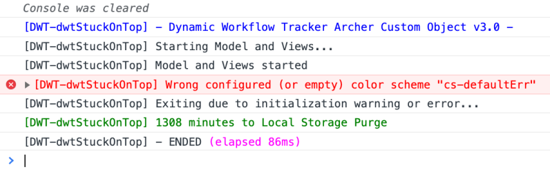
Error management
DWT is also designed to detect as many error conditions as possible, to enhance the overall resilience. The custom object has the capability to display errors directly on the web form, in the same location the tracker is visualized. The picture below shows this capability in action:
The error messages have been structured to be self-explanatory and provide guidance about what to change to fix the error.
However, a few errors can arise before the initialization of the error view, for example a wrong name for the div container aimed to host the DWT rendering.
In this case, the error message is displayed directly into the web browser console:
Again, the error messages are structured to provide guidance on how to solve the problem.
Note: In general, if the tracker does not show up in the web form, the most likely reason is that there is a “low level” configuration issue related to the name of the namespace (if multiple instances are used), the color scheme name or an internal error (e.g. about the network)
Special commands
DWT also supports some special commands that are issued through special key combinations and mouse clicks.
Display Layers
When layers are used, the DWT allows you to display the layer numbers directly on top the phases. Layers are graphically rendered as circled numbers on top of the phases by using a special key-mouse combination, and specifically “ALT-Double Click” (in MacOS the sequence is OPT-Double Click)
So, if this is the list of phases:
As soon as you ALT-Double Click on any phase, layers are displayed like this:
The empty circle means that phase has no layer assigned and as such, it is always displayed regardless the set of selected layers.
The display layer visualization is only temporary, since it’s mostly aimed for troubleshooting purposes along with the log messages displayed in the web browser console.
Layers can also be assigned to sub-phases, but only the selected sub-phase is displayed at run time, assuming the layers matches.
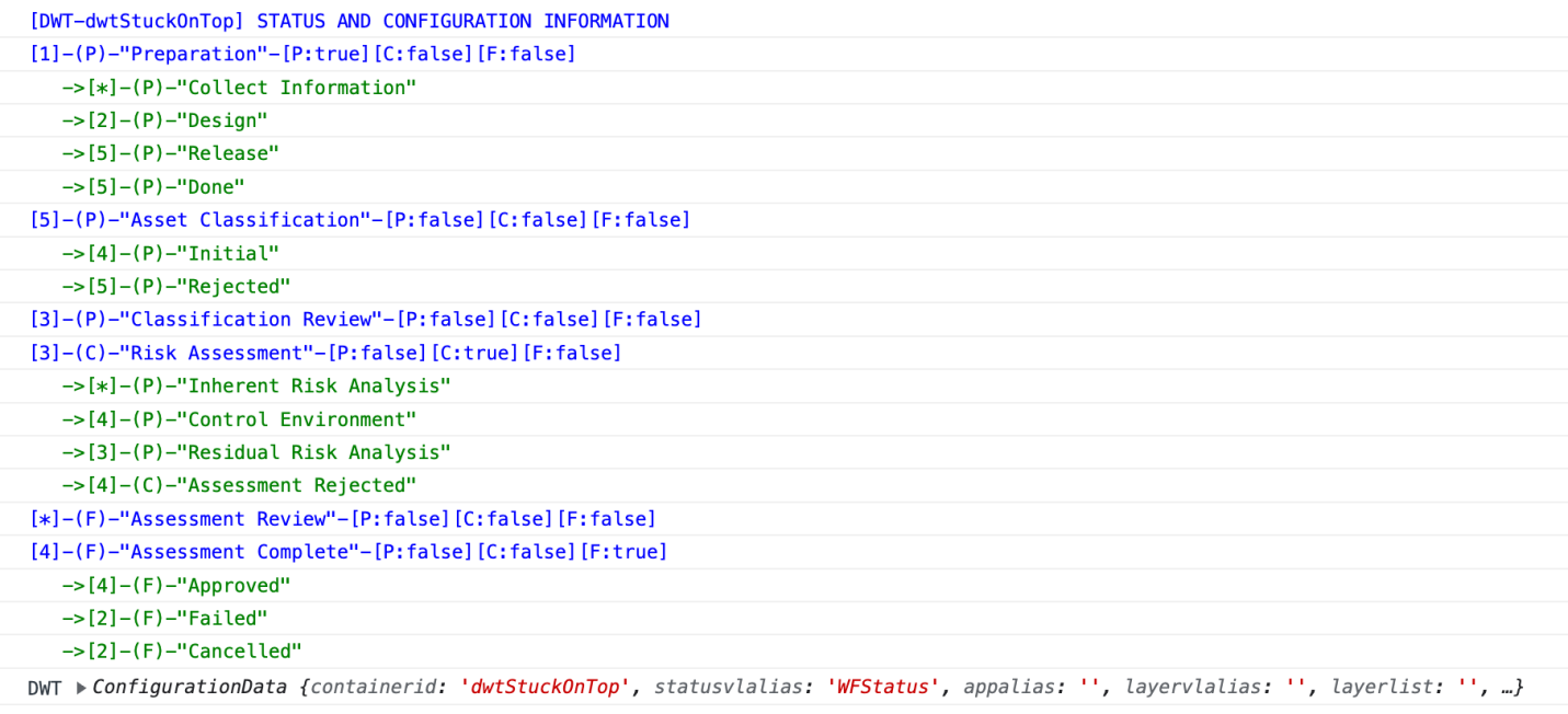
Display Configuration Data
The DWT allows you to display the main configuration information that is used by the custom object to render the phases.
The key-mouse click combination: “SHIFT-Double Click” allows to print in the web browser console a series of information that can be used for troubleshooting purposes.
The picture below shows an example of the information that can be displayed:
The numbers between brackets correspond to the layer of the phase / sub-phase.
Clicking on the “ConfigurationData” arrow, displays the key information read via the CSS configuration parameters.
Troubleshooting FAQ
|
Q: I deployed the custom object, butit does not show up in the content record page? |
|
The first thing to check is the Display option in the custom object property panel (Display when editing / viewing a record). The other reason is a low-level error that is displayed in the web browser console and that is typically related to the name of the namespace (CSS id selector) or the name of the color scheme. Another likely reason is a temporary network issue, and in this case a simple refresh of the web form will fix the visualization issue. |
|
Q: I have configured the JSON object, but the configuration is ignored by the custom object. What did I do wrong? |
|
The most common cause is a wrong format of the JSON object. In case of errors, the content of the whole JSON object is ignored, so that the tracker can still be displayed, but the content of the popover does not leverage the basic configuration options. Please check the quotes, colons, and the commas to make sure the syntax is correct. Also consider that some “ghost characters” might be included, especially if you copy/paste the JSON content from the web or a Word document. In this case, first copy/paste the JSON into a text editor to remove formatting. You may also check the web browser console if some errors show up. |
|
Q: What if I disable a values list item? |
|
The DWT acknowledges the status of the values list items. Considering the values list items can be organized as a 2-level hierarchy, the following policies are enforced: If the item at level 1 (parent) is disabled, all the children items are disabled as well. If an item at level 2 (children) level is disabled, only that item is disabled. Sibling items and the parent item are left intact. |
|
Q: I deployed a package with an application that hosts the DWT custom object and the visualization of the phases is wrong (out of synch with the expected ordering). What’s happening? |
|
The reason is that when you move an application across two different environments (e.g. from dev to prod) the custom ordering you configured for the status values list might notbe preserved. This issue can be easily fixed by editing the values list items and restore the ordering of the items and save the field or simply save again the field. |
|
Q: Where on the record layout can I place the custom object? |
|
You can place the custom object in any section, even if it’s collapsed. You can also place it into a Tab, but this must be the default one, otherwise the custom object will not run. If you plan to display the DWT in a position other than the top (“stuck-on-top” option), you have to define another simple custom object that includes only the div element where the tracker will be rendered (e.g.: <div>DWTcontainer</div>). In this case, you can drop this custom object in tabs that are initially hidden, assuming the main DWT custom object follows the previous rules, because it must run as soon as the record is opened. |
|
Q: On the top I see a red banner that displays the message “You must select an item of the Status Values List <name>”.What does it mean? |
|
The values list you are using to track the status to render, is currently set to the item “No Selection” which means that no item has been selected, because the valis list has just been created or it did not have a value assigned. In general, the best way to prevent this is by setting as default item, so that a default status is already selected when the record is created. |
|
Q: I configured the icons via the JSON content, but the icon does not show up and I see many spaces before the name of the phase. What’s happening? |
|
The DWT object only supports the Material Icons by Google. The name of the icon must be one of the set available here https://fonts.google.com/icons If the icon name is mistyped, the custom object has now way to check it at runtime, so blank spaces are displayed. The solution is to check the name od the “mdicon” property in the JSON content. |
|
Q: I see the workflow tracker only when the record is opened in edit mode. Why is that? |
|
The Archer custom object has a display option (at the bottom of the property panel) that includes these three options:
The first is the default one, so you must change the option to the third. |
|
Q: I have selected, through the status values list, a specific item, either first or second level, but the DWT does not display it. Why? |
|
The most likely reason is that you are using the display levels (static or dynamic) and the layer associated with the values list item does not match with any of the configured layers. The solution is to check the configuration of layers. You may delete the numeric layer in the values list item, so that it’s always displayed regardless the configured layers. |
|
Q: I am creating a new content record for a DWT-enabled application, but the tracker does not show up. What is the reason for this? |
|
To display the tracker, the custom object needs to read the structure of the values list. When a record is not yet committed in memory (saved at least once), the custom object needs to know the App Alias to fetch this information. So, the solution is to configure the --dwt-app-alias parameter with the application alias of the level of the application that hosts the status values list. |
|
Q: I click on the information / help icon of a given phase, but the tooltip does now show up. Why? |
|
Tooltips (popovers) leverage an open-source library available on the internet and dynamically loaded when the custom object runs. If, for some reason, this library cannot be loaded, the tooltips will not work, and a warning message is displayed in the browser console. This error is typically temporary and it’s not blocking. |
|
Q: I changed the configuration of the custom object (CSS variables) but when I access the record page, it seems to have had no effect. What is the reason for this? |
|
This is due to the web caching and in general this affects specific configuration changes, like the values list aliases. When you change the configuration of the custom object, the best practice is to completely clear the cache of the browser. In general, there are multiple alternatives in clearing the browser cache, so you need to refer to the specific browser. If you use Chrome, you need to start the browser console (F12 key), right-click on page reload button and select the “Empty Cache and Hard Reload” option. Other browsers have different procedures |
Performance
The DWT custom object includes a caching tool that is aimed to minimize the number of API calls, to improve the overall responsiveness and performances.
The rendering process of the DWT requires to retrieve some data form the Archer content record and this operation translates into a series of REST API calls that take some time to complete. The API execution delay is the key factor for the overall responsiveness and depends on the number of calls, the workload of the Archer instance and the network latency, which is basically unpredictable.
Some of the information retrieved by the APIs is rather static. This pseudo-static information can be related to the application (e.g. the Application Ids) or related to the specific content record, while the status values list content can change fairly quickly, for example due to the steps in a workflow.
To improve the overall responsiveness, it’s possible to store the outcome of the pseudo-static information into a high-performance storage, so that they can be retrieved from this and avoid the round trip across the network.
For this reason, the DWT uses internally a caching system which is broken down into the record-independent pseudo-static information and the record-dependent pseudo-static information.
The status information and the layer information are never cached since they cannot be considered pseudo-static, considering they may change frequently.
The cache storage the DWT uses is the web browser Local Storage that supports the persistency of data. This storage is fully open, and its content can be observed by using the browser console:
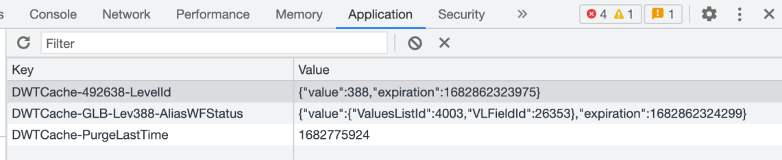
Considering that multiple applications can embed the DWT and users can access multiple content records, the number of items stored in the Local Storage can potentially grow at a high rate. This is why an automatic Local Storage purging mechanism has been added to the DWT. The purge operation only applies to the DWTCache specific items, and the latter are automatically purged every day (assuming the custom object is started). A specific message in the browser console displays the ETA to the next purge operation.
Average execution time
The DWT tracks the execution time for every instance the custom object starts, and this time execution information is displayed in the web browser console:
Multiple tests have been done in various testing conditions, enabling the various functionalities and measuring the execution time for the record reading and new record creation, when the cache is empty (worst case) and when the cache hosts the value to retrieve (best case). The following table summarizing the average measured times for the specific conditions:
|
|
|
Existing Record Read |
New Record Read |
||
|
Functionality |
Notes |
No Cache |
Cached |
No Cache |
Cached |
|
Status VL only |
Only the status VL is configured (most typical case). New records disabled (no App Alias configured), and no dynamic display management. The static display layer configuration does not impact performance. |
<1.1s |
<0.6s |
N/A |
N/A |
|
New record capability added |
Of course, the reported time only applies to new record creation. |
<1.1s |
<0.6s |
<1.2s |
<0.4s |
|
All enabled |
This is the worst case, because of the additional API calls needed to pull the display layer from the specific values list. |
<1.8s |
<1.1s |
<1.4s |
<0.4s |
Note: Since the overall responsiveness depends mainly on the API response time, i.e., network latency, the reported values are purely indicative.
The performance measurements highlights that the worst-case time is about 1.8s when all the capabilities are enabled and when the cache is empty (this means the content record was not previously read). Any subsequent read operation on the same record involves a 1.1s delay on average.
If the dynamic layers are NOT used, which can be considered the most typical case, the average execution time to render the DWT while reading a content record, ranges from 0.5s to 1.1s.
Distribution
Custom Object Code
The DWT custom object code included in the distribution zip file, is available in two versions:
-
Development version: the source code is in clear and includes all the comments. This version is good for debugging activities, as it’s easier to follow the code and the operational logic.
-
Production version: the CSS code (except the CSS variables) and the JavaScript code (except the main function) are minifiedand mangled. This is a technique aimed to reduce the size, hence improve the loading speed. Minimization, which does not include obfuscation or encryption,removes any comment and indentationand changes the names of JavaScript variables, so it’s rather unreadable. This version is the best option for production environments, thanks to the file size reduction. In case of errors, the best practice is to replace the custom object with the dev version, to facilitate debugging and troubleshooting.
The development version is provided for your learning or debugging in case of problems.
Whenever possible, always use the production version which is smaller and a bit faster.
Sample application (DWT Demo)
The DWT distribution (zip archive) includes a sample Archer application that is aimed to get started as quickly as possible, so that you can be familiar with the functionalities and configuration.
These are the steps to install the application and run the first step:
-
Install the package (no mapping required) selecting all the components. Ignore the warnings related to the Findings application and the advanced workflow. Enabling the latter, is optional.
-
Create a new record (you need to set a name for the record) and set a values list item for the status values lists (you may take a look at the configuration parameters in the custom object source code).
-
If the values list items are scrambled, you can edit the application with the Application Builder, set the item ordering dropdown to custom and reassemble the items as desired.
Certification environment
Date Tested: January 2026
|
Product Name |
Version Information |
Operating System |
|
Archer |
2025.12 |
Windows 2019 |